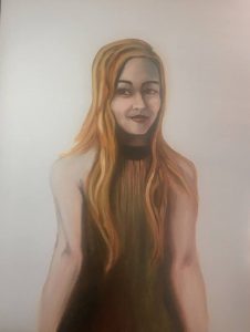
My newest experiment is based on using two colors to build up a skin tone and continuity throughout the painting.
I actually got the idea from “Lessons in Classical Painting” by Juliette Aristides.
Venetian red and viridian green were used for the dress, skin and shadows (Rhea’s Daughter.) Some classical artists use only two colors (with black and white) to create an entire portrait.
The red and green with white makes a nice creamy peach color. I was surprised that no yellow (Naples or Ochre) was needed to make the flesh appear natural.
However, I was forced to break out and use yellow ochre anyway to achieve the blond hair. I tried mixing different varieties, but I could achieve only brunette with the palette. (Next time I do this, the model will be dark headed.)
I then used the red and green in the hair to add texture, shadow and keep continuity.
I am pleased with the result.
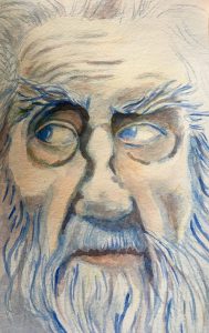
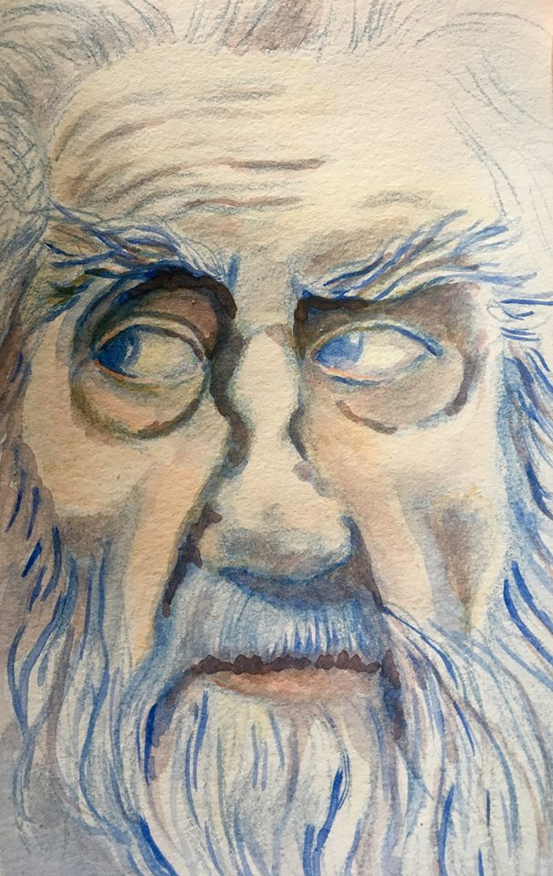
I took the same theory and applied it to a watercolor portrait.

In this painting, I did the initial drawing with a blue draftsman pencil. I then mixed an earthy red (as close to Venetian red) with a yellow ochre and diluted the pigment so I could do washes. I then added blue back to the palette for shadows and eyes.
This painting happens to be my grandfather, who has stunning blue eyes and white, white hair. He also was a country and gospel music icon.
Plus, I was able to keep the work traditional: No white was used.
By limiting my colors, I was able to create more cohesive portraits. I love how the entire painting draws upon itself and repeats colors as though it is poetry.


Goood blog post. I absolutely appreciate this site. Thanks!